
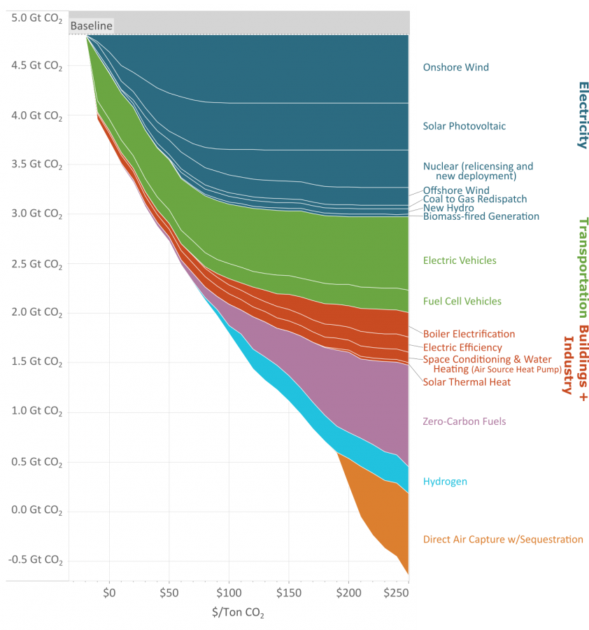
As you reduce the amount of carbon emissions (the y axis) the methods to keep reducing carbon cost more (the x axis.)
This great graph came to my attention from this video from vlogbrothers. It also has some good explanations of what it means.
Note that carbon capture doesn’t really make sense till you’ve exhausted all the other emission minimizing methods.
Source: https://www.edf.org/revamped-cost-curve-reaching-net-zero-emissions
If you need a video to explain your graph, is it really that good of a visualization?
I’m sorry but what the hell is this figure trying to say?
Its like an inverted stacked area plot, but I’m yet to figure out how I should be interpreting it.
A ‘beautiful’ presentation should be immediately obvious in terms of how to interpret it.
From what I can tell, this is saying that…
I can’t tell what the hell this is saying…
This should not be a stacked area plot. this should be a line plot, and the data surely should not be stacked. I think its a total misrepresentation of whats going on here. These lines are not cumulative, unless you are considering some kind of optimization curve, in which case ‘cost’ should be flipped to ‘price’. But then why is that axis in giga tonnes when it states that it is in cost per metric tonne, then how is it tonnes on the Y axis? Should be dollars?
And even then it doesn’t make sense because the scale of the y axis is backwards. if it was ‘price’, it could be reconfigured to make sense.
Looks like something one of my students would turn in when they are just guessing on how to make a plot in excel without engaging with the material (although its clearly made in R). Remake and resubmit for half credit.
(I’ve read the methods. This figure should be remade by swapping x and y. Y should be labeled cost per mega gram to deploy (and should be in megagrams, not gt), x should be carbon offset capacity. If this was done, it would be easily interpreted as the points and price points (in units of $/ megagram of carbon) at which a given technology becomes cost effective.)
I know up and to the right is boring, but its intuitive and there is no need to have drawn this curve in this way.
The video explains it pretty well. It’s very information dense. But it’s how much it costs to minimize carbon emissions by various methods depending on how many giga tones co2 we are currently emitting.
Just, from a data is beautiful perspective, if I have to watch a video to understand one of your figures; that ain’t beautiful.
Its actually not a super complicated figure, the point its making is just obfuscated by its presentation.
“carbon capture doesn’t make sense” lol
If across the world enough trees were planted to equal the size of Amazon rain forest, that would be 300 billion trees and 7.5Gtonnes CO2
So more than entire graph.
But you need to plant that every year in perpetuity, while still burying the logs so decomposition doesn’t release the co2 again.
Why would the logs be emitting CO2 (rotting?) if they are alive and growing?
Because they’re only alive and growing till they die and rot. Sometimes trees do both at the same time, rot from the inside out. You can’t just plant trees for carbon capture, you also need to deal with how to permanently sequester the carbon.
Let’s say that for millions of years a healthy biosphere grew around forests and the balance worked. Now you come to tell us it doesn’t. Wouldn’t you think it’s a bit unconvincing?
We’ve only been pumping out co2 for a hundred or two years. We can’t keep doing that and expect the old balance to hold up.
