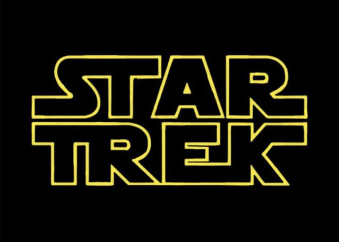
I know that, but it just looks weird. Though on second thought, maybe the issue is the connection between E and K. Star Wars has the R and S connected, but there it looks like a natural extension of the strokes made when writing the letters. Here it doesn’t work nearly as well, and the second line already has two connected letters with T and R anyway. So after thinking about it a bit more, I think I’d just cut the connection between E and K. The K still looks a little odd, but it conforms to the SW logo, and at least the entire bottom right corner doesn’t stick out like a sore thumb.
In the original “Star Wars” logo, the extensions on the text are adjacent. I think they’re trying to mimic the original.
I know that, but it just looks weird. Though on second thought, maybe the issue is the connection between E and K. Star Wars has the R and S connected, but there it looks like a natural extension of the strokes made when writing the letters. Here it doesn’t work nearly as well, and the second line already has two connected letters with T and R anyway. So after thinking about it a bit more, I think I’d just cut the connection between E and K. The K still looks a little odd, but it conforms to the SW logo, and at least the entire bottom right corner doesn’t stick out like a sore thumb.
Font nerds?! In my Trek nerds shitpost??
Well! Harrumph.