Another remaster that misses the point
Today Blizzard announced remasters of its classic fantasy real-time strategy hits Warcraft I&II, the games that put it on the map in the distant, functional past of the ‘90s. I should be celebrating; the second Warcraft as unequivocally my favorite game as a young child. I spent God only knows how many hundreds of hours playing it, and even He eventually got bored of watching me make my own horrible little maps and walked away. These remasters, though? They ain’t it.
I’ll preface this by saying that I’m very glad these classics remain playable. I’m sure Blizzard’s making a pretty penny off doing so, but at least it’s keeping its history alive. That said, I will be playing these re-releases with the new graphics turned off, because just look at them:
Warcraft Remastered Battle Chest Launch Trailer
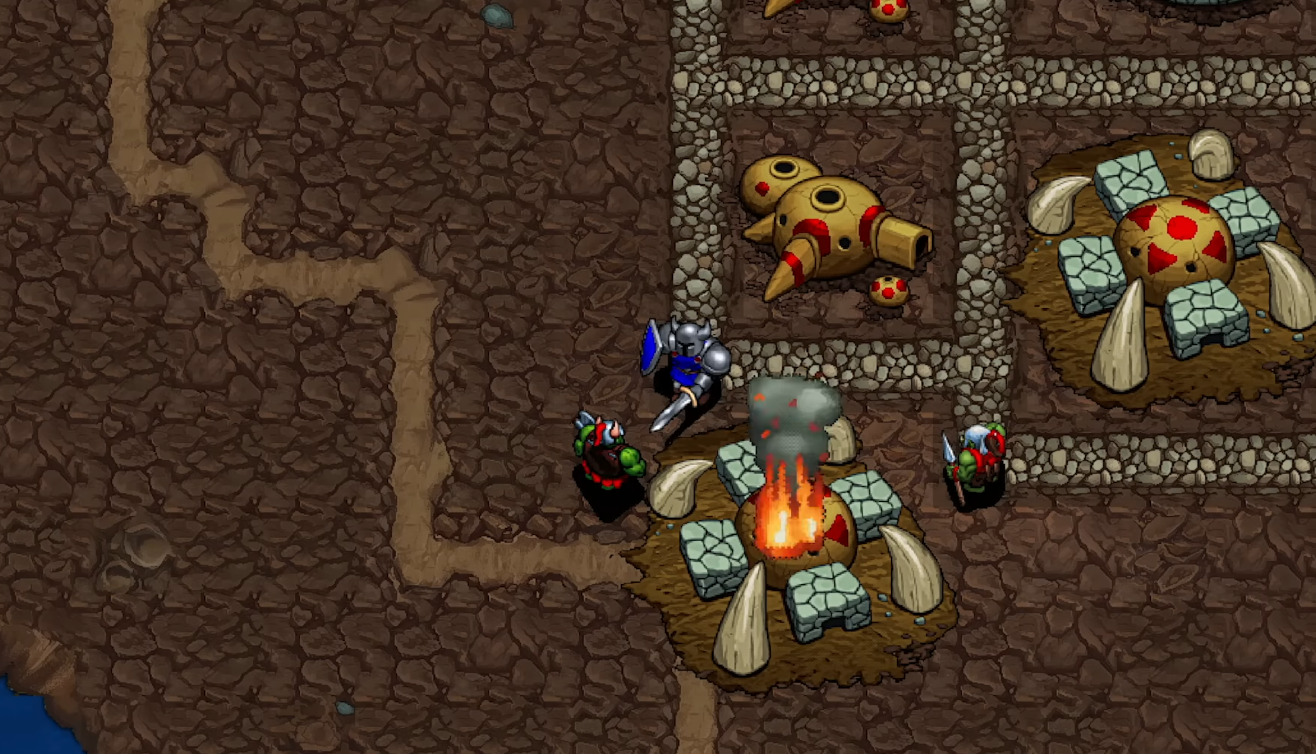
The art looks basic and generic where the original pixels inspired imagination, letting your mind fill in the gaps of these units’ physical features. Some, like Ogres and Ogre Magi, appeared almost photorealistic to young me, who sought to recreate them (over and over and over) in drawings and other, larger-scale art projects. In trying to more fully inhabit this universe whose collection of Little Guys inspired me to dare to dream, I constructed life-sized (relative to an eight-year-old) paper dolls of nearly every unit in the game. It was my Everest, entirely because – again – the original game left room for interpretation.
Now admittedly, I’m no longer a small child fueled entirely by starry-eyed wonder, and that’s definitely part of the problem. But Warcraft’s original look was a product of its limitations, and trying to pave over that with plastic-y sheen is a mistake. I don’t know who the new graphics are for – I doubt these old games are going to lure in many new players, especially with art that looks like it belongs in a vastly less-intricate game than Warcraft – but it’s certainly not me.


The best remaster was D2R. They made it look EXACTLY like my imagination did back in 2001. It looks incredible.
D2 always looked like shit to me. D2R is the first time that game has been playable for me. Especially with wide screen support and the ability to bind quick cast keys. D2R is top tier.
D2 looked amazing to me but I was on a 640x480 CRT in 2000-2001, so my little imagination put it all together. But damn shit fuck, D2R was done SO WELL.
I swear I played D2 at 800x600 - was that enabled in the expansion pack?
You’re 100% correct! I upgraded later, but my fam had a horrid Celeron machine for most of my life and it needed low rez to play well. ATI RAGE II I believe.
Even back in the day I felt it was too cramped and awkward. I was more of a starcraft kid.
I loved StarCraft but Diablo REALLY brought me to imagination town. The graphics were such shit but the world was so huge and dark and deep, I loved Diablo sooooo much when I was young. I was just flabbergasted by how much D2R looked like what I had imagined. I went back to the original graphics settings (with filters to make it traditional) and it was HORRIBLE. but as a kid… I was so enthralled.
the “original graphics” settings in D2:R are far worse than what D2 actually looked like. I dont know exactly whats wrong with it, but if you actually have D2 and run it, it looks much better.
Oh you’re not wrong! There’s a special filter you can enable in settings that makes it look more true to what you would have seen on a CRT monitor. When first switched to original settings I was like “absolutely no way it was this shitty” hahahaha
Vicarious Visions’ team for that game needs the equivalent of an Academy Award for what they achieved (and no, I don’t mean Geoff Keighley’s flatulence).
Hahahaha could not agree with you more. When I started it, I was blown away at how EXACTLY LIKE MY IMAGINATION it was.
Literally my only complaint is the Amazon’s model. More svelte in my mind, less… «hand waves» that.
Completely understand where you’re coming from! It’s not terrible but I also had a bit of a different char in my imagination.
Weird thought: I never realized the paladin was black when I was young, but at that time in my life I just didn’t really realize people were different colours because I grew up with a wide gamut of skin colours… when I saw the remake I was like “oh yeah! That tracks!”
The sorc was exactly what I saw when I played as a kid. That was my most played char (under paladin) and she was exactly what my brain said she was.