in a timid voice “staaahp” 😩
sobs (quietly) “please…”
stop
“Excuse me sir/madame I would like to request that you please stop here by the solid line before progressing on. If it’s not too much bother that is. Thank you for your precious time”
I think this is a Chik-Fil-A parking lot stop sign—the branding is spot on.
EDIT: Actually, I think I recognize the surroundings, too. This is the Chick-Fil-A off Hobbs Rd in Huntsville, Alabama: https://maps.app.goo.gl/fod76mqmB7sNhEqE7
I think it’s the serif font, more than the lack of capitalization, that weirds me out.
Imagine if it was a handwriting font? “Live, Laugh, Stop”
stop…
🎀𝓢𝓽𝓸𝓹🎀
reminds me of signs in The Village from The Prisoner
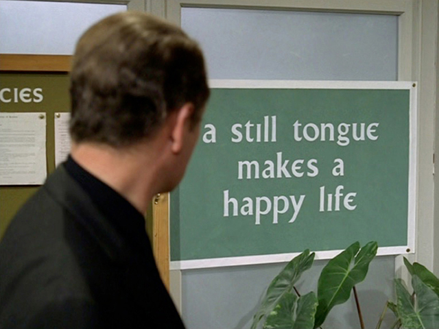
That looks like a beautiful modernised gaelic typeface.
It is! Someone made a freely available font file of it, too.
Awesome! Gotta share this with my wife, an absolute nut for The Prisoner.
Thanks!
I hate it.
stop
It means it’s just a recommendation.
My guess is that’s more like in SQL: you can shout if you want to, but DBMSes also understand lowercase
it somehow feels condescending.
stahp.
submissive ass sign

