

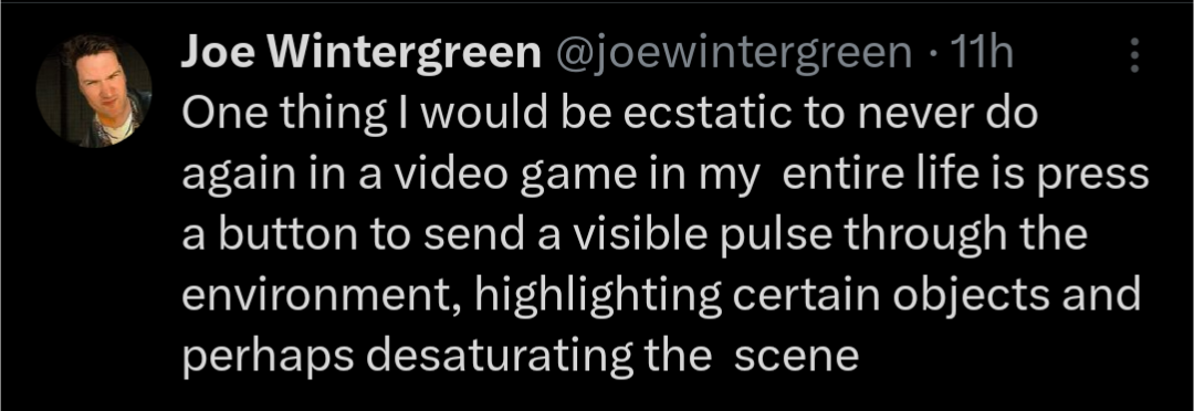
I see a lot of people saying that this is an accessibility thing, while also allowing you to not miss anything important
But a well designed, uncluttered environment can do both of these things while giving you a more immersive experience
But we can’t do that, because we’re in an endless chase to get the most realistic graphics, and how else are we going to show that off than overly detailing each pixel of stationary on a worker’s desk?
I also see a lot of people saying “just don’t use the feature if you don’t like it”
There’s a famous quote I like. “Given the opportunity, players will optimise the fun out of a game”. And you can bet your ass I do that. In any game with this “scan” feature, I’ll be tapping that like a relapsing porn addict, looking for any new quest npcs, missed collectables or just to see if I’m on the right path. I have a similar issue with minimaps, as they have a comparable effect on gameplay
It’s because in older games, you could clearly differentiate between the background and the gameplay relevant sprites or models drawn over it. It was a technical necessity but it doubled as communicating to the player what’s important. When technology advanced past that being technically necessary, something needed to take its place. The pulse is just one of many ways to do that and the easiest one to integrate into a realistic artstyle. When you get more stylized, your options open up considerably.
Honestly I would prefer it to just be a highlight, like in CRPGs where either itll highlight the outline of the object or the object itself.
Unpopular opinion maybe, but I LOVE that shit!
If mandatory: meh
Accessability feature for players with impaired vision: great bloody UXt, your local UI/UX guy
Honestly if I could do this in real life for an object I’m looking for, and have the object ping and light up and flash and shit, I would love it.
I use Tile trackers for this. They’re pretty good.
If the game has a lot of stuff but only some of it is actually interactive, there should be a way to disambiguate.
I remember the first time I sent out a ping in the voxel-based action-adventure game Outcast (1999). I thought it was the coolest thing I’d ever seen.
There are good and bad implementations, but going to have to disagree with op on the whole.
The only game I’m aware of in my library that has a feature like this is Satisfactory, the “ping” feature to find nodes they tutorialize but you’ll probably quickly stop using because you use an external map for planning/get to know the map.
Witcher series.
Not in my library.
If it’s like a fast fading wave but the highlight stays then thats fine.
If it’s a toggleable mode that shows you only closeby items that you have to pick up and look at in a specific order, then fuck right off. Especially when it’s so fucking obvious that theres a suspicious bloody knife stuck in a tree but I need to follow footprints to it first.
The Batman Arkham games kinda do that right? Except it was more of a toggle when you had it on or not?
That’s different. The detective mode is actually useful for when you have to clear a room. It’s so good that some of the last and hardest enemies in the game are not visible while using it.
Duck Hunt!
The first game I remember doing this is The Witcher 2. Not sure if that’s the first game to come up with the idea, but it’s the earliest example I can remember.
I’m thinking Splinter Cell had this kind of feature.
deleted by creator
If you don’t like it, don’t press that button
As I’m getting older, I’m definitely starting to appreciate that I just can’t see shit. If the game’s going for an ultra-realistic environment, then there’s just so much more visual clutter that I need help picking things out.
In my opinion, it’s just an accessibility feature. Those are always nicer to have than to not. But if you’re a purist, or you don’t have any problem finding things, then I’d also hope you’d be able to disable it.
The problem is that games are designed for it to be used. I hated using Witcher senses in Dying Light 2, but good look finding lootables without it. It’s a cop out solution.
It really depends on the game, you can’t put all games under an umbrella and say it’s all bad. I love the ones in Starfield, warframe, No Man’s Sky, Assassin Creed Origins and Odyssey and many more. As long as it has actual uses more than just highlighting stuff and/or is well designed it’s always welcome IMO. Haven’t played DL2 yet but I really can’t think of any game where it felt like a cop out for otherwise bad design.
💯 Playing through Red Dead Redemption 2 and there is so much detail and it’s beautiful.
…but then when I’m trying to pick out herbs and plants and it’s all so beautifully rendered I don’t know what plants and flowers can be harvested and which are just there to be pretty. Dead Eye is a lifesaver for that.
That desaturated-with-highlighted-items vision is a design choice that does solve a problem even in realistic worlds – even if it’s just to show players something the character can see but is hard for the player to spot.
If you look at old games, the reason they didn’t need this was because they couldn’t have nearly as many props in a scene. I like to use classic WoW as an example. It didn’t have any kind of highlighting for objects to interact with, but you didn’t need it because there just weren’t that many objects period.
Highlighting interactables, whether it be through a pulse like the meme, or just based on proximity, is a compromise in modern games to make things playable while also having dense, prop-filled environments. The infamous white or yellow paint for climbing surfaces is another example.
I doubt many designers love these solutions, but they’re currently the best we’ve got. It’s not an easy problem to solve, but I hope a more immersive solution comes along someday. In the meantime, having it is better than not, I totally agree with you.
You actively choose not to use it but if you didn’t know about such a mechanic, sometimes you might end up like this.
When one guy is playing Morrowind and the other is playing Skyrim.
Avatar : Frontiers of Pandora has had me going like Rowan when played in explorer mode. It gives you hints like in other recent Ubisoft games but holy shit some of those were near useless… I wasted entirely too many hours just exploring and circling around the correct answer. I recently switched to the more friendly Guided mode and it has the waypoint only appear in Hunter mode, so that was kinda nice. Hasn’t completely spoiled the experience although I still wish it would only activate once you were in the vicinity indicated by the clue (ie, if the clue gives you some corner of the map to explore, then the guided mode would only start helping once you’ve reached that general area).
But yeah, overall, I disagree with OP. Make it optional, make it diegetic, make it subtle, but the option is a wonderful game design element, in my book.
One thing I think is that the longer time you need to use it, the harder you’ve failed in you basic design, because I shouldn’t have to press the damn button 90% of the time like I used to in Far Cry Primal. That game is still my favourite as a precursor, but I was using the hunter vision way way way too much.
Recently started a replay of the PS5 BioShock collection (1&2). In 1 the items shimmer to let you know they’re there to interact with, in 2 that setting is off/disabled by default and you don’t realize it until you go digging through the settings after wondering where all the stuff is/went because you sit 15ft/3m from your TV. Utterly frustrating dev choice on normal mode play defaults.


